

A slideshow on WordPress is a collection of images or videos that can be scrolled through. This handy design tool enables you to incorporate lots of media content into a smaller space without cluttering the rest of your webpage. From online shopping platforms to blogs, slideshows are a ubiquitous feature on many websites.
Creating a slideshow on WordPress is a straightforward process with the correct plugin. However, it’s crucial to consider best practices to ensure your slideshow captivates and engages your website visitors.
In this article, we will provide five top tips to help you create an engaging slideshow on WordPress. Let’s dive in!
📚 How to create slideshow in wordpress:
- Keep slide navigation simple
- Turn on autoplay
- Ensure mobile compatibility of your WordPress slideshow
- Avoid overloading with slides
- Properly size images for your slider design
1. Keep slide navigation simple ⛵
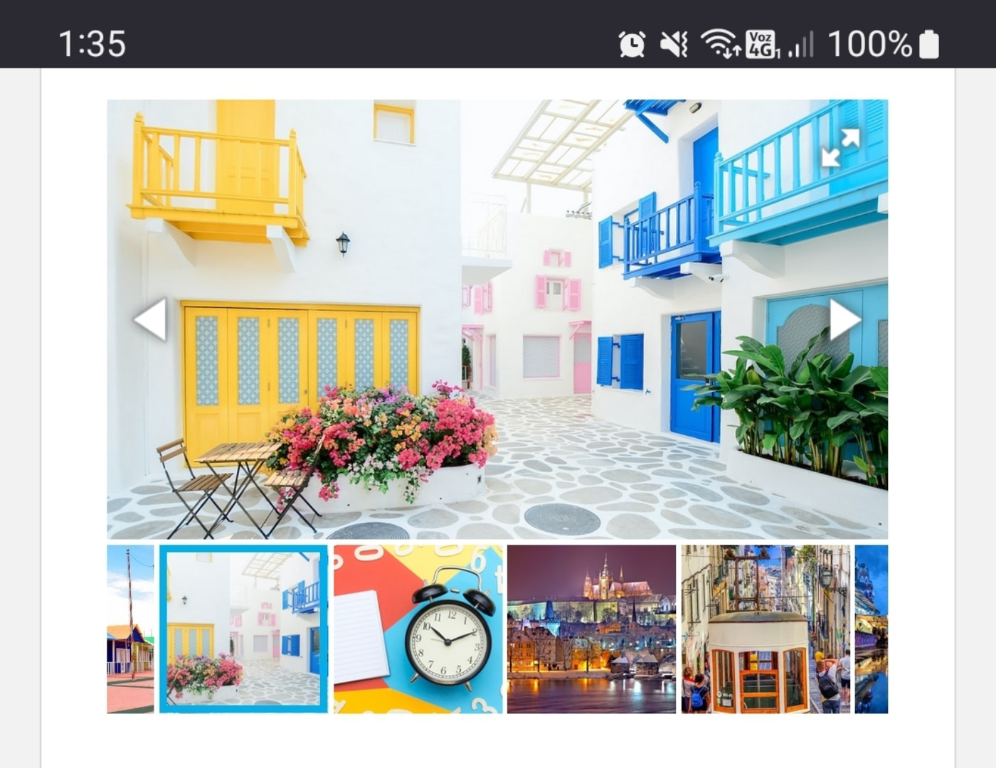
The key distinction between many online slideshows is the method of navigation. A common method is using navigational arrows that allow you to click through each image:
Some galleries utilize dots to indicate the current image and allow image skipping. Different types of icons can also be used for slide navigation across various devices.
In our view, it’s essential to have multiple ways to navigate through the slides. This gives visitors the flexibility to choose the method they’re most comfortable with.
We recommend having a friend or a team member test your slides. Monitor their navigation methods and consider whether they found the experience smooth or not.
A WordPress slideshow that’s not user-friendly won’t retain visitors past the first image. As a result, they might miss out on crucial content. Therefore, it’s vital to minimize friction and ensure smooth navigation.
2. Turn on autoplay ▶️
Autoplay is generally frowned upon for most webpage media elements like videos or audio. However, for sliding galleries, autoplay could be beneficial. Having the gallery automatically scroll to the next image can free up visitors to focus on other elements of the site.
Most WordPress slider plugins, such as Otter Blocks, provide an autoplay feature. You can typically set the delay before moving to the next slide and add transition effects to highlight changes.
There is no strict rule for setting the wait time between transitions. We recommend allowing users a few seconds to view each image. Ensure that transitions aren’t abrupt; otherwise, users can struggle to find their desired images.
3. Ensure mobile compatibility of your WordPress slideshow 📱
A beautifully designed WordPress slideshow on a full desktop screen may not necessarily translate into a great experience for mobile users. With most internet users browsing through mobile devices, responsiveness becomes a top priority [1].
If you haven’t already, take the time to check how your slideshows appear on mobile devices. It’s best to test using different devices to ensure optimal display across various resolutions:
If you have to scroll to see the full slideshow or if it’s not touchscreen-friendly, then it’s not responsive. This can be addressed by using a WordPress slider plugin that automatically formats elements for mobile responsiveness.
4. Avoid overloading with slides 🎢
There’s no definitive rule for the “perfect” number of slides. Each image or video in a slideshow should serve a purpose, whether it’s showcasing a product, a location, past work, or anything else that’s relevant.
The issue arises when there are too many items in a slideshow. While users might scroll through a handful of images, they’re unlikely to view all if you have over 20 slides.
You may end up having images on your site that no one gets to view. If the last few slides contain vital information, there’s a good chance visitors won’t see it. Remember, additional unused images can also impact your website’s loading speed.
When designing a slide, frequently ask yourself, “Are all these images or videos necessary?” Any removable content without affecting the slideshow’s purpose should be cut, which increases the likelihood of visitors viewing all slides.
5. Properly size images for your slider design 🌄
A common mistake when creating a WordPress slideshow is not accounting for image size relative to the gallery. Slideshows often use a rectangular layout, making flat, landscape images a perfect fit.
When you upload vertical images, they may look odd in your slideshow. Depending on the slider, it might try to resize the image or add blank spaces on the sides to avoid stretching.
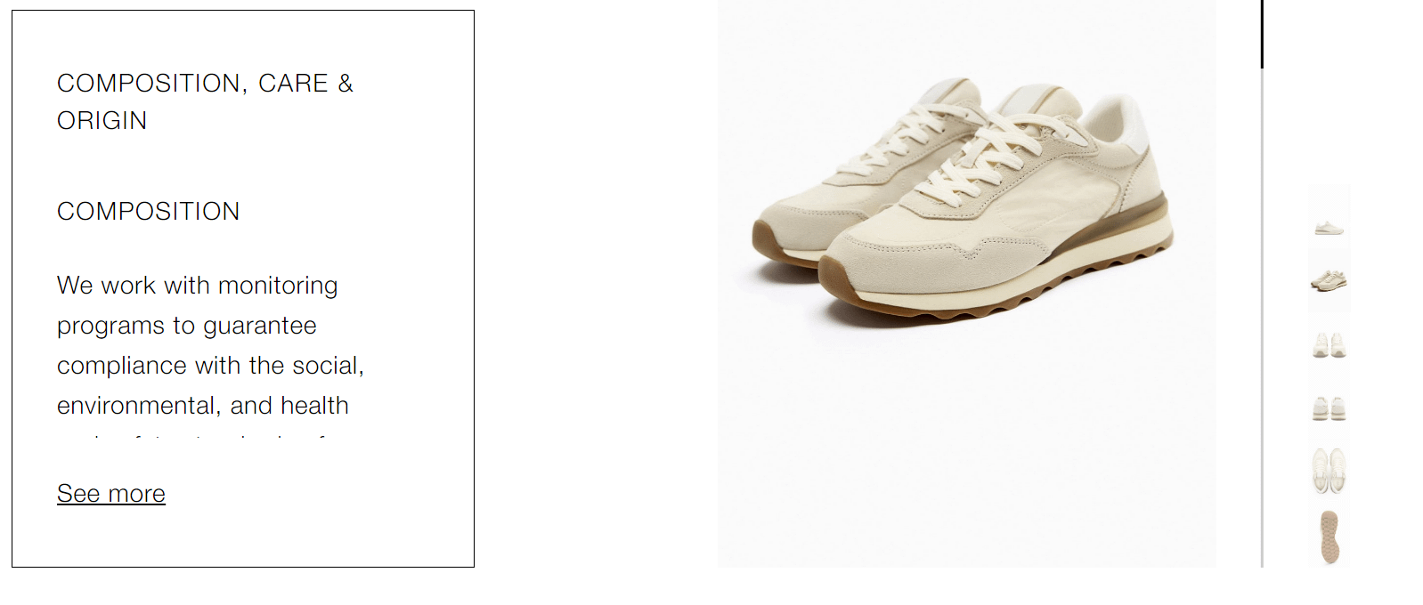
Both of these design choices can detract from the slideshow’s appeal. It’s best to adjust the slideshow’s size based on the types of images you want to include. For instance, if you’re using slideshows for product galleries, a more square or vertical design could be more suitable:
Be mindful that you can add unlimited slideshows in WordPress. This allows you to customize each slideshow to best feature the media elements you wish to highlight so that visitors are drawn into them.
Conclusion 🧐
Creating engaging slideshows on WordPress is a breeze with the right tools. However, the real challenge is creating a WordPress Slideshow that visitors want to see and that effectively encourages viewer engagement.
🧩 To create a WordPress slideshow that captivates users, remember these key points:
- Keep slide navigation simple ⛵
- Turn on autoplay ▶️
- Ensure mobile compatibility of your WordPress slideshow 📱
- Avoid overloading with slides 🎢
- Properly size images for your slider design 🌄
Do you have any questions regarding creating a slideshow in WordPress?


